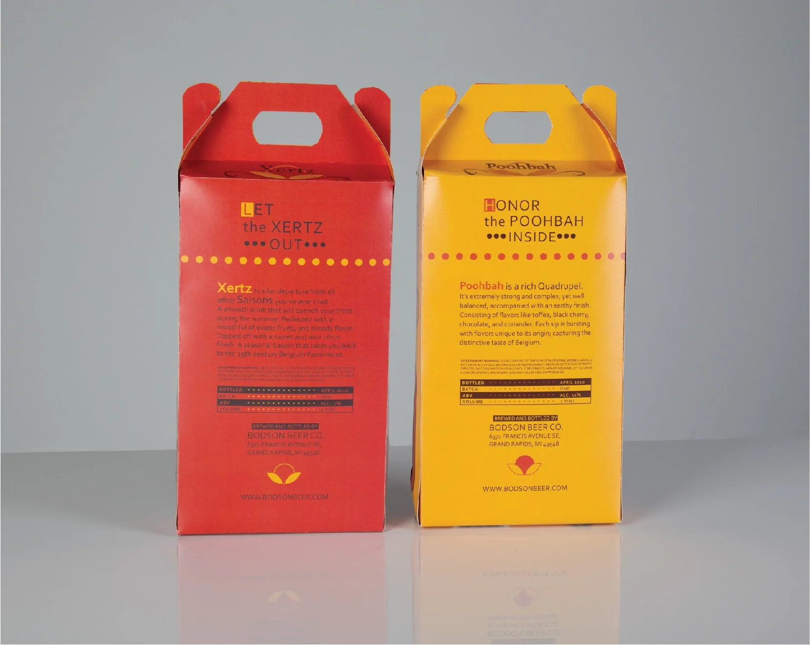
Bodson Beer
Design Objective:
Bodson Beer is a brewery located in Grand Rapids, Michigan. The company’s beverages appeal to beer enthusiasts who appreciate the strong historical brewing practice of Belgium. Belgium beer is famous for being the top beer in the country. With a huge following in the United States, the company would like to create a strong art identity for the consumers that appreciate creative artwork and respect quality Belgium beer.
Design Brief:
Quality with visual appeal influence the company’s consumers buying decisions; therefore, the logo’s artwork is inspired by Belgium artifacts and rendered in an abstract art style to represent the company’s identity.
Intricate Belgium-inspired design (solely created for Bodson Beer) and an effective typography layout is reinforced throughout the packaging, beer label, and coasters. The beer labels are based on Belgium and Viking history and uses traditional rustic colors: gold, brown, and red (signature colors of Belgium).
A specialty packaging was created for the bottle. The packaging is a custom-carry box with double corner windows to showcase the artistic beer labels. Muse was used to create a multi-page website that displays close-up glamour shots of the company’s beers. All the pages in the website comprise of contents that are consistently laid out in a clean visual arrangement.


Sweet Venture
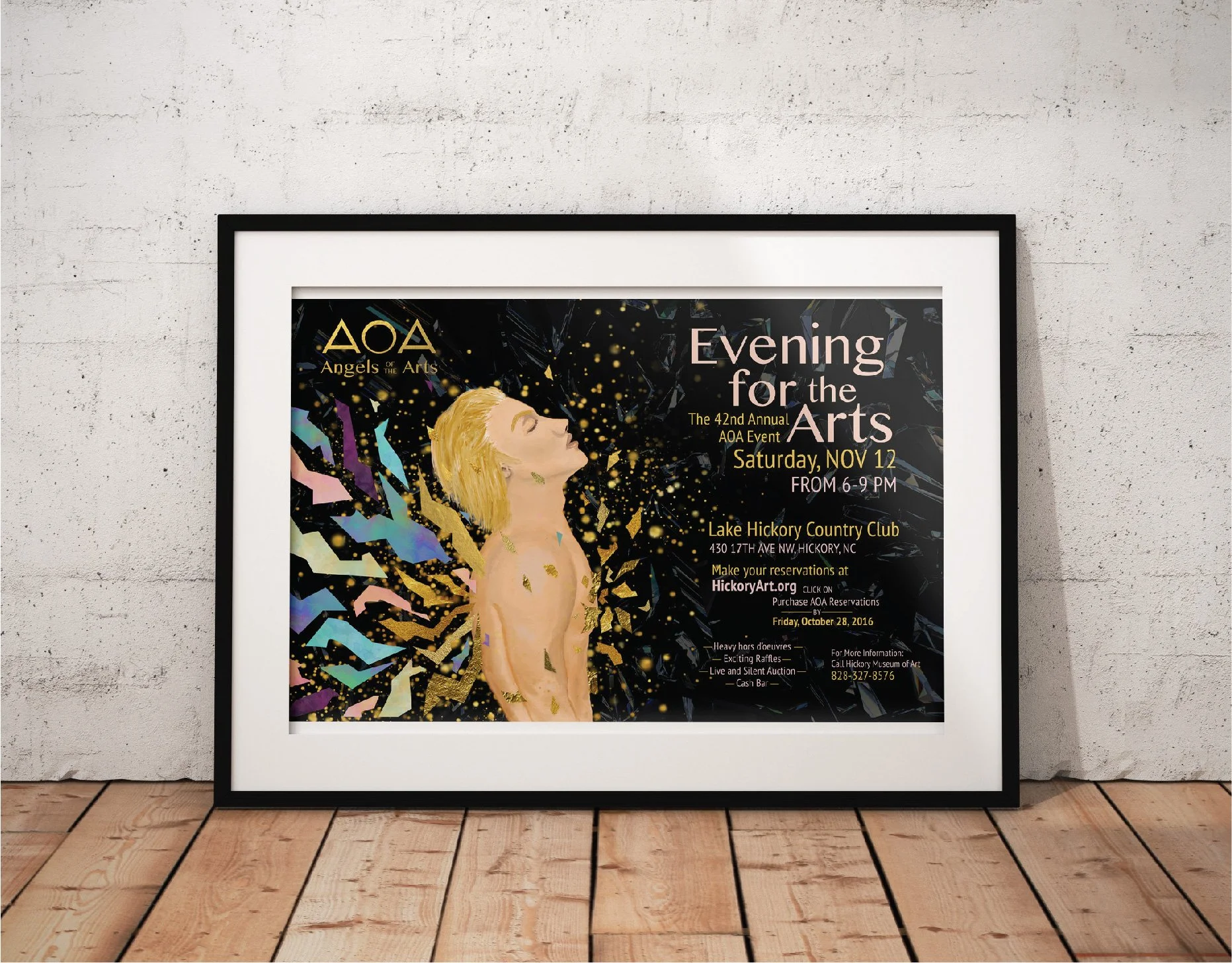
Angels of the Arts

Chernozem Infusion

First Petal Font Book

Passion Aid

Children's Creativity

Virginia Woolf Book Covers

Risk Taker

Bodson Beer

Golden China Opera

Herb Lubalin

Lamb Graphics