
Herb Lubalin
Design Objective:
Research the graphic designer, Herb Lubalin. Create a tri-fold brochure as a “tribute” describing his life, work, and contribution to the design field.
Design Brief:
Herb Lubalin saw no limitations in design and pushed back boundaries for an entire generation of designers. The objective was to pay tribute to what he had accomplished by basing the brochure on his vision and most prominent works. Lubalin is notably recognized for his expressive typography, so I laid Lubalin’s most famous typographic logos in a continuous frame (from left to right). Some of Lubalin’s works consisted of a lot of overlapping and his color palettes were very minimal - mostly comprised of black, white and blue. Lubalin favored simple and functional designs rather than complicated designs, and his use of minimal color palettes and overlying letters motivated the vision for the brochure. To carry his style into a pleasing composition, the rule of thirds was used to divide the content vertically and horizontally – keeping the composition clean. Lubalin’s work aesthetic is replicated into a purposeful layout by arranging a continuous line of imagery, usage of a limited color palette, and repeating numerical typography throughout the brochure.


Sweet Venture

Chernozem Infusion
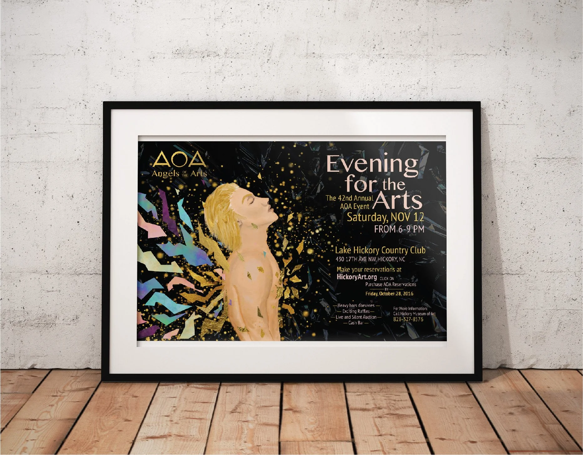
Angels of the Arts

First Petal Font Book

Passion Aid

Children's Creativity

Virginia Woolf Book Covers

Risk Taker

Bodson Beer

Golden China Opera

Herb Lubalin

Lamb Graphics