
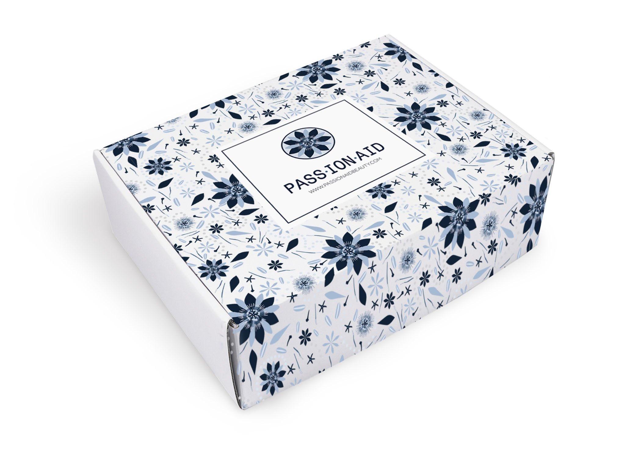
Passion Aid
Design Objective:
Passion Aid is a Christian-based beauty line that focuses on clean ingredients. Their goal is to bridge the gap between premium ingredients and affordability. They hold strong to their Faith and business principle of harvesting the healing properties of God's healing plants, as written on their mission statement.
Passion Aid knows that well balanced skin comes from a healthy body, soul, and spirit; thus, Petal Crown is formulated with premium ingredients that combine targeted skin benefits and aromatherapy. The company needs a whole new branded look that represents their faith, and embodies the look and feel of a luxury clean beauty line.
Design Brief:
After analyzing research of the business, the goal is to strategize a brand look that can communicate the company’s unique position with their first product launch. An outstanding brand identity that stood out was the company’s name, Passion Aid. The unique meaning behind the company’s name inspired what the branding for Petal Crown would be, which is a Passion Flower. In the 16th century, when Christian missionaries landed in South America, the passion flower was the plant that signified their success. They believed that the flower symbolized the death of Christ. The five sepals and petals represented the disciples (minus Peter and Judas), the corona filaments symbolized the crown of horns around Christ's head, and other features were a symbol of the wounds, nails, and whips used on Christ- hence the name passion flower. The color palette consists of a spectrum of light and dark blues. The color blue is mentioned several times in the Bible and signifies the healing power of God. An organic and pronounced look of a passion flower was chosen to reflect the brand and elements of the logo were carried into the main pattern and brand materials.


Sweet Venture
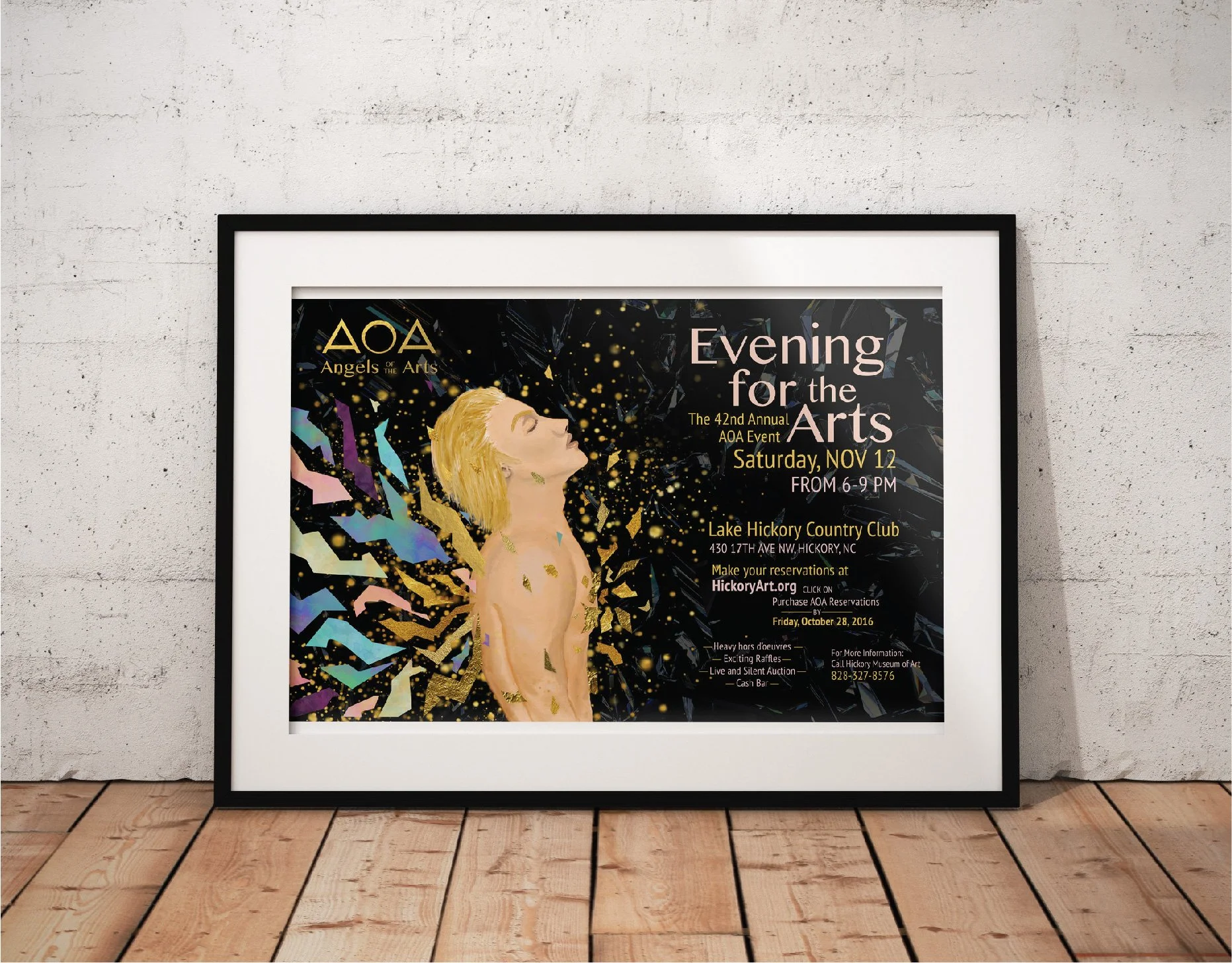
Angels of the Arts

Chernozem Infusion

First Petal Font Book

Passion Aid

Children's Creativity

Virginia Woolf Book Covers

Risk Taker

Bodson Beer

Golden China Opera
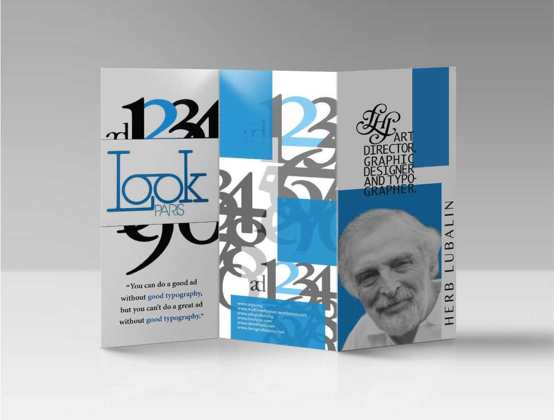
Herb Lubalin

Lamb Graphics