First Petal
Design Objective:
The first step to learn how to create more effective typography is by creating your own typeface.
A fresh take on typography is needed to give floral industries a new identity. The intent is to create the type’s anatomy in precise measurement and general standards professional typographers use.
Design Brief:
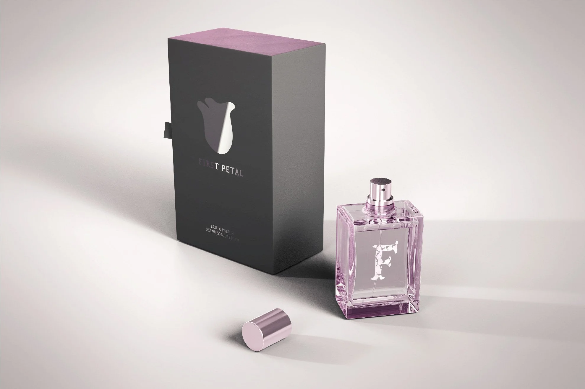
First Petal Perfumery is a perfume company in need of a typface to represent their identity. As a result, First Petal alphabet build was exclusively created for the company. The typeface features petal-like serifs and floral counters. The classification of First Petal is decorative serif. The font is bold and is intended to grab reader’s attention.
To demonstrate the characteristics of “First Petal”, a typeface specimen and perfume packaging was created. Gray and lavender are combined into the pieces—since they show extremely well when trying to create a light, soft, and sensual atmosphere.
The whole type specimen is meant to be read as a whole; continuing a symmetrical visual on all the pages. The pages read: “First sense. First touch. First kiss. First love. You never forget your first”. The prose resembles a catchy slogan that sparks the feeling and memory of an unforgettable romance – like a classic perfume saga/commercial.
By creating a typface using a standard typographer’s guidelines and basing the design elements around the typeface; a professional and elegant design was allowed to flow continuously throughout the type specimen book and perfume packaging.


