
Virginia Woolf Book Covers
Design Objective:
Virginia Woolf’s three classic books: To the Lighthouse, Mrs. Dalloway, and Orlando, require a new modern feel to attract readers of different generations. The objective is to research the books and integrate a strong concept from all three books into the design.
Design Brief:
Virginia Woolf is best known for her nonlinear prose style, where time and events are not in chronological order. In all three books, time streams in and out of consciousness. Therefore, all three book designs are type-focused, with time tied into the typography.
In ‘To the Lighthouse’, time is experienced unconventionally. The novel mostly covered one day and then skip 10 years to another day; therefore, time is elongated and compressed. For the cover, a clock is broken into pieces to illustrate the absence of time.
In ‘Mrs. Dalloway’, the book only covered one day. For that reason, time was used creatively. For the cover, time is shown in a vortex-like shape to represent the character’s thoughts in the novel. The character’s thoughts were very fluid constantly going in and out of past and present – resembling the fluidness of a vortex.
In ‘Orlando’, time spans 300 years in the novel. Time is subjective and is based on changes in the monarchy, inventions, and is rarely stated by Woolf. For the cover, a circular timeline was used to depict the 5 decades insinuated in the story. The timeline starts from the 1500’s and ends in the mid-1900’s—where the book also abruptly ends.


Sweet Venture
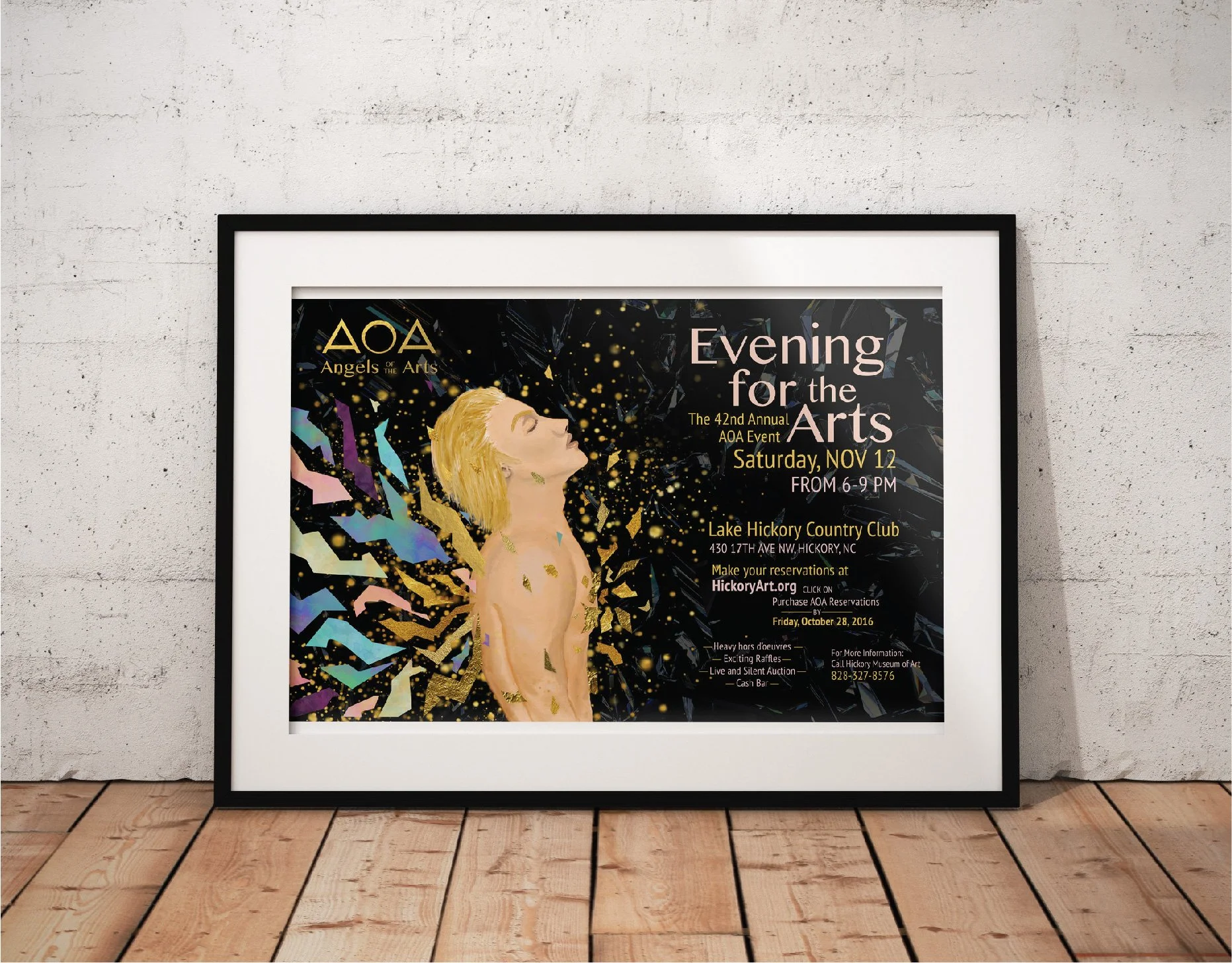
Angels of the Arts

Chernozem Infusion

First Petal Font Book

Passion Aid

Children's Creativity

Virginia Woolf Book Covers

Risk Taker

Bodson Beer

Golden China Opera
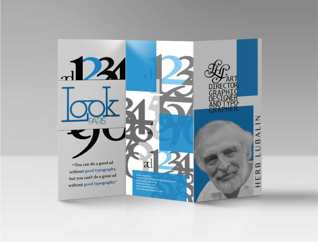
Herb Lubalin

Lamb Graphics