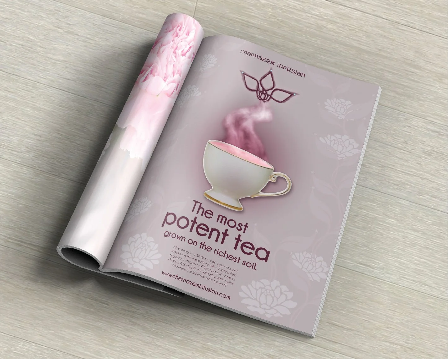
Chernozem Infusion
Design Objective:
Chernozem Infusion’s focus is cultivating superior quality white tea on the world’s best soil. The company operation is established in the Ukraine (the bread basket of Europe, known for its black soil – the richest of all soil). Chernozem Infusion’s identity and packaging should reflect their beliefs and aesthetics, appealing to their audience with an exclusive design.
Design Brief:
Silver Needle and White Peony are organic loose white tea leaves and the top two finest and most expensive tea in the world. Ukraine is best known for their black soil, known as Chernozem (where the company’s name originated).
The two naming conventions for both teas are “Needle in a Haystack” and “Flower of the Flock”. “Needle in a Haystack” is used to classify Silver Needle (the company’s finest white tea). The name is an idiom, which means an item that is very hard to locate. “Flower of the Flock” is the classification for the company’s second purest tea; the idiom meaning – the best thing in a group.
The branding is inspired by Ukraine. The deep burgundy color is pulled out from rich Ukrainian designs such as fashion. The logo is a symmetrical tea leaf design based on Ukrainian patterns and embroidery. At the end of each tea leaf is a circular element that follows the example of Ukrainian architecture. The circles also resemble the buds from white tea leaves and is carried throughout the logo, typography, and line work.


Sweet Venture
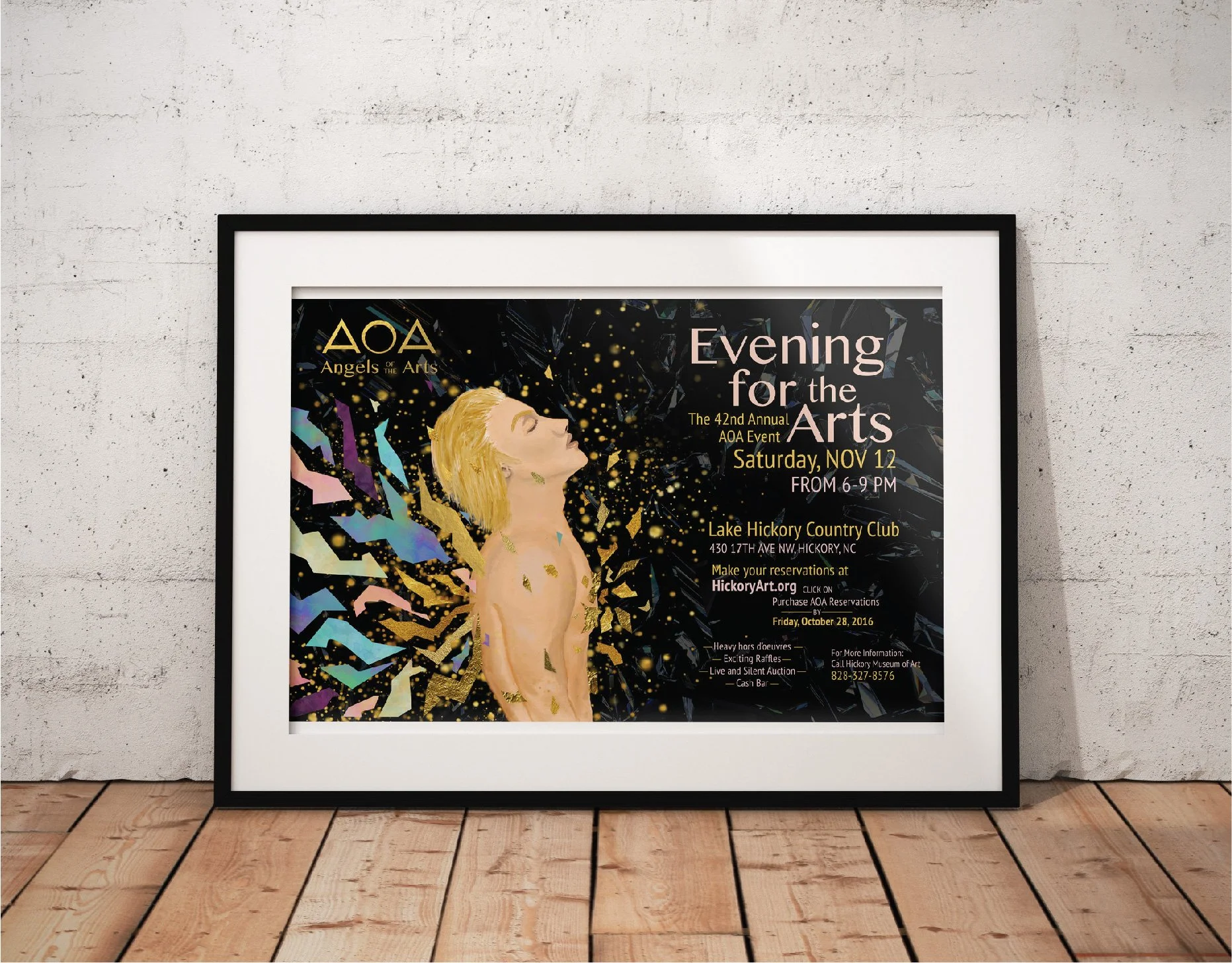
Angels of the Arts

Chernozem Infusion

First Petal Font Book

Passion Aid

Children's Creativity

Virginia Woolf Book Covers

Risk Taker

Bodson Beer

Golden China Opera

Lamb Graphics
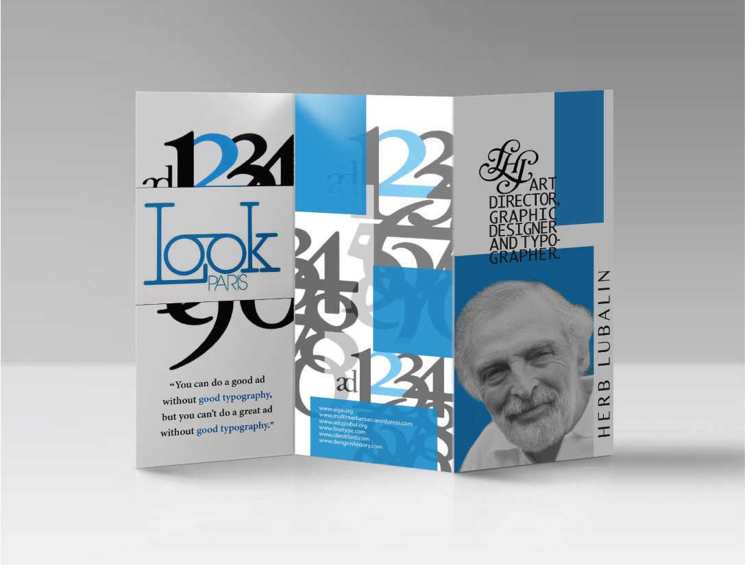
Herb Lubalin